Spring portrait sessions are well under way and the most asked question I get is WHAT SHOULD WE WEAR? Even I get a little stressed when it comes time to pick out the clothing. While it's certainly not an easy task, it's not one that should provide an abundance of headaches. Over the next few weeks, I will be posting tips and examples to help make your spring family portrait session a breeze to style. And, of course, if all else fails, call me. :)
Tip #1: Coordinate, but don't match.
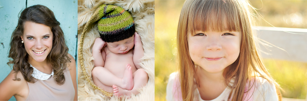
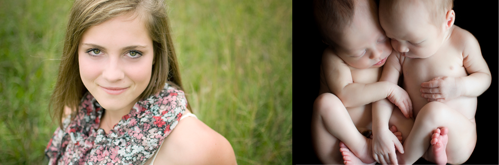
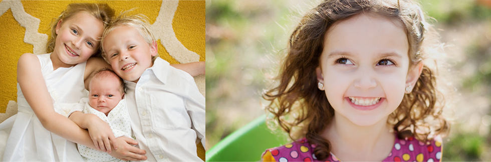
I always like to pick one pattern or color and go from there. Since I'm the only girl in my family, I think that I should be able to get away with being the "pop" of color or bold print. Sometimes, I'll pick a cute patterned dress and then match everyone else to that. I've gotta get something for being on my own on this island of testosterone! If the momma doesn't want to be the star, the littlest lady of the family always looks cute with a print dress, or give your little guy a bright vest to wear or a bow tie in a bold print and then go from there. Pick 1,2, or even 3 coordinating colors and then blend them with neutrals like gray, cream, or navy.
Check out the collection below. Why does this work, you ask? Start with the print top in the middle. All of the bold colors come directly from that palette (coral, yellow, and green). Throw in some neutrals (cream, navy, and brown) and you've got the perfect combination for spring portraits that pop!
Stay tuned for more tips on how to make your spring session the best it can be!
Have these posts delivered straight to your inbox!
Enter your email under "follow by email" to the right and you'll never miss out!
Until next time!
:)
Melissa